By: Monica Peña (@MUNDUmedia)
As Pantone, the global authority on color, celebrates its 50th anniversary; it is a good time to reflect on the influence of color way beyond fashion. If used consistently through a brand’s marketing, the use of certain colors can trigger the senses and certain memories. The use of two or more colors can generate brand awareness any time these color combinations are used. It is particularly important that colors are consistent throughout branding, whether used in web sites, newsletters, business cards, e-mail interaction, and especially in logos.
The strategy of color selection is important depending on what the target audience is and/or what the company will stand for. Companies that tend to be trend setters and can be more versatile about changing their image frequently, follow the present color trend. Whether you’re going for earthy hues to show your earth conscience or bolder colors like red to stand out to a different viewership, this detail is one that needs much consideration.
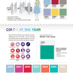
Take a look at this fun info-graphic that celebrates 50 Years of Pantone Color and shows various colors from wardrobe shades, social media top colors, to choices used in creating brands. Pantone color info-graphic


